Digitechtual > The 7 types of logos (and how to use them)
Digitechtual can create all the logos of a combination of typography and images, each type of logo gives your brand a different feel. And since your logo is the first thing new customers will see, you want to make sure you get it right.
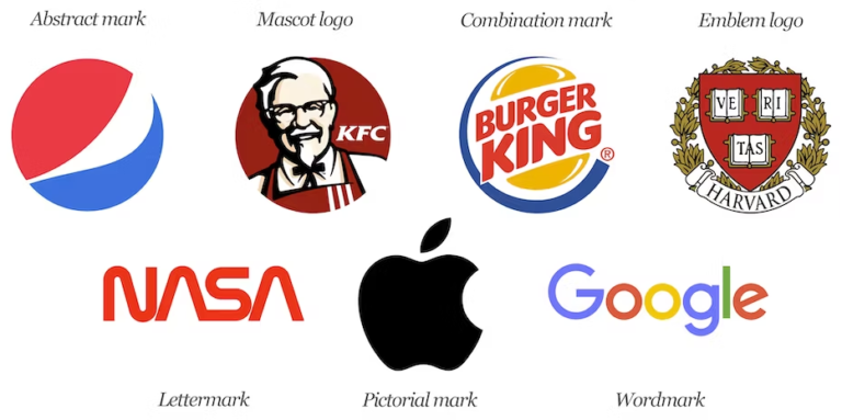
Here are the 7 types of logos you need to know about:
Monogram (or lettermark) Logos
Wordmark (or Logotypes)
Pictorial Mark Logos
Abstract Logo Marks
The Combination Mark
Mascot Logos
The Emblem
1. Monogram Logos (or Lettermarks)
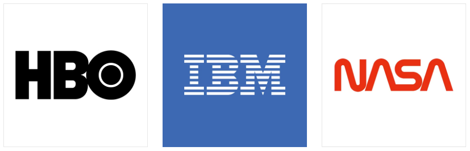
Monogram logos or lettermarks are logos that consist of letters, usually brand initials. IBM, CNN, HP, HBO… Noticing a pattern, yes? They’re the initialisms of a few famous businesses with rather lengthy names. With 2 or 3 words to remember, they’ve each turned to using their initials for brand-identification purposes. So it makes perfect sense for them to use monograms—sometimes called lettermark logos—to represent their organizations. The font you choose (or create) is very important to make sure your logo is not only on-theme with what your company does, but also legible when you print on business cards. Also, if you’re not an established business already you may want to add your full business name below the logo so people can begin to learn who you are right away.
2. Wordmarks (or logotypes)
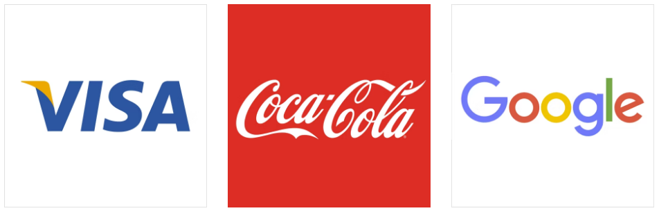
Similar to a lettermark, a wordmark or logotype is a font-based logo that focuses on a business’ name alone. Think Visa and Coca-Cola. Wordmark logos work really well when a company has a succinct and distinct name. Google’s logo is a great example of this. The name itself is catchy and memorable so, when combined with strong typography, the logo helps create strong brand recognition.
Also, like with a lettermark logo, typography will be an important decision. Since the focus will be on your name, you’ll want to pick a font—or create a font—that captures the essence of what your business does. For example, fashion labels tend to use clean, elegant fonts that feel high-end, while legal or government agencies almost always stick to traditional, “heavier” text that feels secure.
3. Pictorial
This is a graphics-based logo.
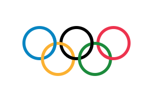
Nike, Olympic rings, and Domino’s Pizza are examples of brands with Pictorial or logo symbols. Being household names, the logo makes them easily recognizable. Conversely, this may not be suitable for brands that aren’t as established or whose brand recognition is not as strong. However, if your brand chooses to go with a Pictorial logo, you must choose your image carefully, as it’s going to remain permanent.
4. Abstract logo
These logos express wide-ranging concepts and feelings with one symbol, making them a popular choice for brands that have plenty to say. These logos typically consist of shapes, patterns, illustrations, line symbols, and more that convey a brand’s message with non-literal imagery. Adidas, Xbox, and PlayStation are examples of brands with an abstract logo, whose key benefit lies in communicating a brand’s message using symbols. Such use of colors and shapes elicits brand sentiment and emotion.
5. Combination Mark
As the name suggests, a combination mark is a type of logo that combines lettermark, pictorial and abstract symbols.
Picture and text can either go side-by-side, be integrated as one to create an image, or be stacked one over another.
Adobe, Puma, and Gatorade are popular examples of combination marks that strengthen the brand-audience connection.
An advantage of combination marks is they are easier to trademark than, say, a pictorial logo because the text and the symbol fuse together to create a unique distinction.
6. Mascots
These logos include an easily recognizable brand ambassador in their design and make a particularly great choice for brands that want to cater to children and families.
KFC’s features Colonel Sanders, Melinda Lou is featured on Wendy’s, and so on.
Mascots are closely associated with sports, where it first became a concept in helping stimulate excitement among the audience.
Brands that choose to use a mascot logo must take into account whether they want their illustrated character to be a serious or playful character to fit the brand theme.
7. The Emblem
This is a type of logo that has an icon or font inside a symbol.
Starbucks’ mermaid emblem and Harley-Davidson’s prominent crest are prime examples of emblem logos which are also commonly seen on badges, crests, and seals.
These logos often strike a traditional appearance and, therefore, are a popular choice for schools, government organizations, and agencies.
The traditional design also makes them less versatile for most other brands to adopt.